AS Media
G321
Foundation
Portfolio
Friday 31st October
Thriller Film Opening 1 - The Number 23
For research I will have to analyse various thriller openings. My first analysed thriller opening is from the film 'The Number 23' directed by Joel Schumacher, 2007.
Mise en Scene
The background of the shots are styled to look like paper, the paper is off white and looks kind of dirty. This gives a tatty, vintage effect and becomes almost nostalgic for the viewer. This effect is also produced by the fact the shot looks like paper in a typewriter. This typewriter style and design also foreshadows the events and the protagonist in the film, it connects the opening scene with the mental state of the protagonist.
This style creates a sense of mystery and creates anticipation within the viewers of the film; it creates mystery about the subject of the film and what's going to happen. These effects are some of the main intended effects created by thriller films and also very conventional of thriller films.


A minute into the clip we start seeing blood on the pages, this creates suspense and anxiety within the viewer as they don't know why the blood is there, how it got there or why it's there. This makes the audience ask questions and think about what's happening. The blood is put onto the page in one of two ways; splattering on the page or slowly leaking onto the page like blood would on a piece of paper. The blood splattering creates a more violent tone and is implicit of some act of violence or a crime being committed, the audience however only sees the blood, and they are left questioning what has happened. This creates fear; this fear is more panicked and chaotic in its effect. The blood slowly leaking onto the page also creates fear but it creates a less violent effect, it gives off a more melancholy feel as if someone has been lost instead of someone has been murdered. This creates sadness and sympathy in the audience for the unseen characters death.


The splattered blood (left) gives off a more violent, manic effect. Whereas the slow leaking of the blood (right) gives a more melancholy, grieving feel
Often there are repeated words, numbers and marks on the page. They're put together in a block, often overlapping some of the marks are faded and you can't see them properly. This creates an old age effect, like the papers worn out and has been left somewhere for a while only recently being discovered again. This again creates a nostalgic feel for the viewer and makes them connect with the character, who is yet to be seen in the movie. The overlapping and faded marks make it hard to see the whole picture, this is confusing for the viewer as they don't fully know what's going on, this creates intrigue and is a common convention of thriller films. This confusion is also caused by the scattering of the marks and letters around the page, there seems to be no set pattern or order in the entirety of the opening scene, everything is placed randomly.


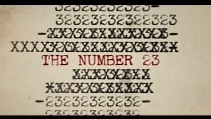
The faded marks suggest the papers old; makes audience think this is something that's been forgotten (foreshadowing events of film)
The scattered marks represent the mental state of the main protagonist and creates confusion within the viewer
The overlapped text represents the manic nature of the film, this is conventional in thriller films.
Camerawork
The camera shots mostly consist of shots of the paper, these shots are from a small distance away, the text is small but readable. There are a few close ups of some text, this means certain words or text is bigger. Because of the size increase the bigger text seems more important and makes the audience think they have to pay more attention to this particular text.
In one shot the camera zooms in on one sentence on the page that's slowly being covered by blood, this makes the sentence unreadable and makes the audience want to know what it says even more than they may have already. The fact it's unreadable means that the viewer becomes more tense and anxious about what's going to happen, they're being left in the dark because information is being withheld from them. This feeling and withheld information are both conventions of a thriller film and in our thriller film opening we will try to incorporate some of the ideas here in order to successfully induce the viewer into a state of confusion and anxiety.

The title is much bigger on the screen and gets a close up, this connotes its importance and exaggerates how important the title is.

The words here are unclear and you cannot see the full sentence.
This creates mystery and suspense as the viewer doesn't know what the information they've missed is.
Editing
The editing is quite slow paced at the beginning of the film and it becomes more fast paced as the clip continues to play. This increase in speed creates excitement and panic within the audience. It creates a sense of chaos and an increase in hysteria. This also represents the manic, rushed excitement of a thriller film as they start slow and gradually get more exciting as the film plays. This creates familiarity for the audience as it's the basic formula for thriller films.
At the very beginning of the clip the screen is black and it fades into the picture, this creates anticipation for what's going to happen because the beginning is slow the audience feels calmer at the speed. If the film started and immediately it was incredibly fast the audience would feel overwhelmed and possibly not be able to keep up with what's going on. This slow start puts the viewer into a false state of security which makes the next things they see more unexpected and sudden.
There's a lot of superimposition and overlapping of images, they happen briefly only appearing on screen for a split second before disappearing. These short sudden images confuse and intrigue the viewer because they don't fully understand what's going on. This creates mystery and also frustration within the viewer as they cannot make sense of what's happening and it makes them feel unsettled and uncomfortable about what's going on.
Titles
The font looks like it's been written on a typewriter, the typography is smart and business like, this makes the text look organised and neat, this creates confusion as the other elements in the clip are contrasting to the neat font, the numbers are everywhere, some faded and overlapping each other. This creates dis-orientation within the viewer because not everything in the shot looks like it belongs together. It also contrasts with the dirty paper, the blood stains and the seemingly rushed typing. This highlights the confliction and puts the audience into a state of dsyphoria because they don't know what's going on in the clip.


In these shots the text is clear, it looks neat and organised like it serves some kind of purpose. This makes the audience feel as though there's some form of sanity among the mess of other things going on around it. This lulls them into a sense of false security.
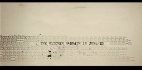


In these shots the text is still the same but there's mess aroud it, faded marks, splatters of ink and in some cases blood.
This shocks and confuses the viewer, it contrasts to what they've seen previously and because of this they become unsettled.
The size of the text varies in the clip; some words and numbers are smaller than others. This pulls focus to the bigger numbers and letters and makes the audience pay more attention and look more cloesly at the text that's bigger. The biggest text shown is the name of the film, this exaggerates the importance of the title and what it represents in the film. This points out to the viewer that the words in the title play a key part in the film and it's something they need to pay attention to. Many of the numbers and calculations are bigger than the other text, this is also done to exaggerate the importance of the number twenty three and the key part it plays in the film. This also makes the audience ask questions about how it's important and creates anticipation to see what's going to happen. I don't think this is something we're going to do in our thriller opening because we want to keep the primary focus of the viewer on the images we're going to use.
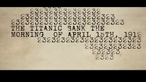


The change in size of text makes certain things seem more important to the audience than others.
All of the text in the clip is black except for the film title; this is again exaggerating the importance of the title and the significance of it to the audience. The red title connotes the danger of the word and makes the audience link the red colour with the blood on the page; this makes them weary of the number twenty three which is one of the main intentions of the film. There is always text in the shots, there's not a shot that doesn't include some form of text this connotes the busyness of the clip and represents the manic nature of the film, this makes the viewer feel anxious and makes them anticipate something bad is going to happen. The text shown in the closest shot is the title of the film, this text is also the only text shown in a red font instead of a black font. This makes it stand out from the other text and makes the audience consider it more important than the rest of the text, this is once again exaggerating the importance of the number twenty three.

The red title connotes danger and makes the audience associate the word with something unpleasant.
When the titles are in the shot the shots tend to be longer than when there's sentences and calculations to do with the subject of the film. This puts the focus on the fast paced, rushed tone of the movie and makes the audience think they should pay more attention to what's moving faster. This also conveys to the audience the fast and rushed mind of the character in the film. It's typical of thrillers to have characters who are often smart and always overcoming obstacles put in front of them by the antagonist, the fast pace suggests that the protagonist is quick and clever and the film will end in the protagonists favour. We don't want to give the audience this impression in our opening, we want it to feel very dark and want the audience to feel helpless and feel like there's nothing they can do.
Events, themes and characters
There are no events or characters in the film. This lack of characters and events suggests that the focus of the audience should be on the text and images used in the clip. It also creates mystery and anticipation for what the audience is about to see because they've seen no characters or possible events, it creates suspense; a convention of thriller films.
The themes of the clip are unclear, since it's a thriller it's assumed criminal activity is a theme because it's the most common convention of a thriller film plot line. We can also assume that the films themes are going to be dark because of the imagery used, there's dirty, crinkled paper and there's splattered ink and blood in some of the shots. This could also connote the disorganised and cluttered mind of the character(s) in the film. We want to make our thriller opening very dark with violent themes so we'll try to incorporate some of the ways they do this in thriller openings.
Sound
All the music in the clip in non-diegetic, since there are no characters in the clip to hear any and all sound in the clip. The background music is slow at the beginning of the clip and gradually gets faster, this creates an increasingly fast loss of control and perhaps even sanity within the audience. This effect is also created by the change in pitch of notes throughout the clip. At the start of the clip the notes are high, as the clip goes along the notes get lower and also begin to overlap in the clip. This creates a sense of confusion and possibly even vertigo from the mixing of high notes and low, deeper notes. The deeper notes are repeated and happen more frequently, this creates an underlying darkness and suggests to the audience there's something more going on than they're been shown.
Along with the background track there are sound effects layered over the top of them. There are various sound effects, some of the more recognisable ones being; typing of a typewriter, a typewriter starting a new line, whoosing noises and splashes. This mix of seemingly random sound effects in the clip creates dis-orientation within the viewer and connotes the dis-order and messiness of the events of the clip.
At the very end of the clip there's a crescendo and the music goes to a very high pitch and then very suddenly and very quickly the music gets very quiet then stops altogether, leaving the audience with a few seconds of silence before the opening scene ends. This suggests to the audience that the film may end suddenly and perhaps leaves them in a state of bewilderment at the sudden end. We want to do something like this at the end of our thriller opening.